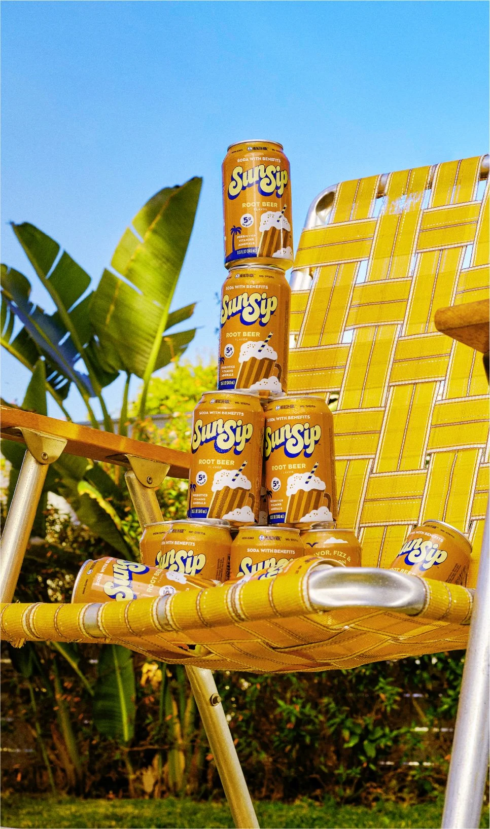
SunSip by Health-Ade: from Function to Fun.
Health-Ade came to us to help them re-enter the better for you soda space and compete against the new category giants. Strategically, we went back to soda’s heyday and positioned the brand to own the uniquely carefree, joyful feeling opening up a cold can of pop can give you during the heat of summer. Ahhh, the ultimate refreshment. SunSip was born. School’s out, sun’s out and your summer of fun is calling your name.
Brand Strategy
Naming
Brand Identity
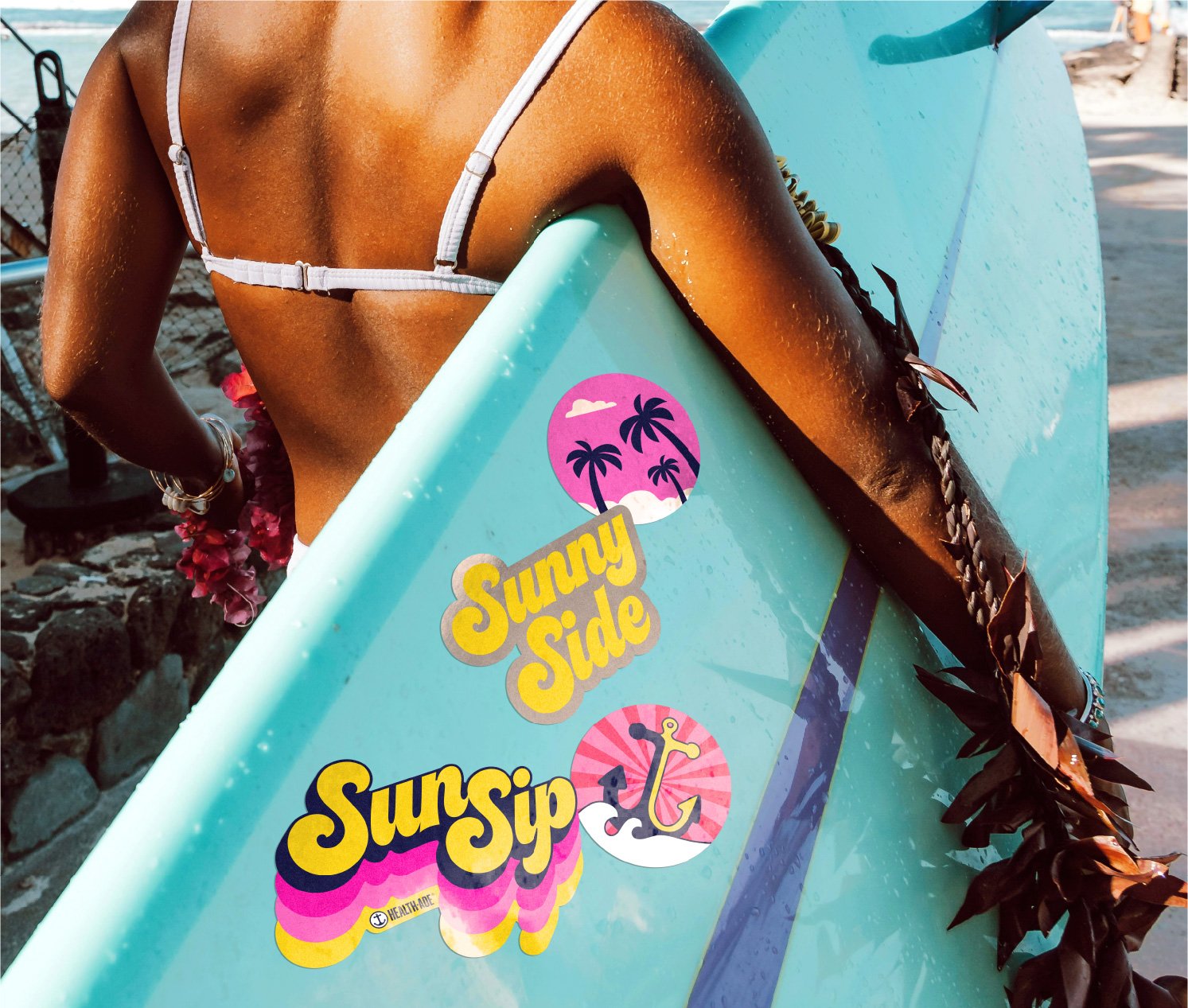
Brand World
Packaging System
Illustration
Typeface Design
Production
SCOPE
70’s nostalgia meets 80’s beach culture in our creative direction. Our iconic illustration style and bright flavor-led color palette put taste front and center, giving consumers first what they want. Health-Ade’s classic blue helps ground the brightness and reinforces the brand’s functional creds, underscoring the things consumers need. A custom typeface (created with The Type Founders) brings the energy and uplift in our wordmark. Whole Foods took 4 SKUs national for launch with several more SKUs and additional retailers rolling out over the course of the year.